What exactly constitutes a “good” website design? Does good design really matter when it comes to a website?
Age-old statements like “don’t judge a book by it’s cover” and “beauty is in the eye of the beholder” may hold a nice sentiment, but they are completely irrelevant when it comes to website design.
Poor website design makes your brand look bad, and can be harmful to your reputation and credibility.
This isn’t an opinion, it’s a data-backed fact. Let’s dive in.
What makes a design “bad”
Let’s start with bad website design. Or better yet, just bad design in general.
Who remembers the rolling death trap known as the Ford Pinto?
In my youth I recall the horror stories surrounding the vulnerability of the Pinto’s gas tank design – more specifically, the car had a reputation for exploding when on the receiving end of even a light rear-end collision.

According to Howstuffworks, Ford execs knew about the fatal design flaw that was literally burning some of their customers alive. They could have fixed the issue for approximately $11 per car – but they thought that this would cut into their bottom line too much. So what did they do to address the issue? They decided to ignore the problem as long as possible. “It’s just business”, right?
Okay, that’s a pretty extreme example on the negative consequences that bad design can have, and I can assure you that your poorly designed website is unlikely to literally kill your customers like the Ford Pinto did.
But the point is that design does matter. A lot more than we may think on a surface level.
Whether we’re referring to safety concerns with the poor design of a physical product, or the potential negative perception to our brand’s reputation that can be caused (or at least greatly exacerbated) by poorly designed digital products like websites.
Bad design and brand perception
When you’re in a department store (remember those?) what is your perception of the store when you can’t find anything that you’re looking for, and it looks like an atomic bomb went off in the clearance section?

You are probably less likely to return, and you’re certainly going to have a negative perception of the brand.
The same principals can be applied to your web presence. Why would it be any different? Because it’s digital? We’ve surpassed a quarter century of the internet being a regular house-hold thing; it’s time to file away antiquated assumptions about digital “not mattering” for your business, because you are wrong.
While social media trends tend to come and go, websites are still here and your website visitor’s user experience should be prioritized.
Bad Website Design
Here’s a real businesses’ website below that is still online in 2023 and does not appear to be ironically built for comedy (blurring the name and contacts of the business to protect the innocent):

I have no idea if this particular business is successful or not, but I would venture to guess that they’ve lost more than a customer or two over the years who land on that abomination of a website and quickly decide they’re going to check out a competitor instead.
How would you feel about clicking on that payment image on the right side of the screen? I would feel more confident lighting my money on fire. If a website makes you question whether you have malware injected into your browser, you may want to reconsider your design.
If your business relies on your website in any impactful way then you should probably care a whole lot about the quality of your website design and providing an amazing user experience for your visitors.
Bad website design not only contributes to a negative perception for your business as a whole, but can also measurably impact your bottom line – especially if you’re selling products or services through your website.
First Impressions Matter
Consider that your website is often the first glimpse into your business for a new prospect. What kind of impact do you hope to make on a potential new customer? If your website is poorly designed and littered with bugs and errors, it’s not going to reflect positively on your brand.
According to WebFX, 94% of first impressions a business makes on a potential new consumer is related to the design of their website. 94%!
The takeaway? A poorly designed website is not doing you any favors, and is probably harming your brand. Investing in a quality website is investing in your brand’s reputation. Just like you probably wouldn’t want a bunch of trash in front of your storefront, treat your digital property with the same respect. Just because your website lives in a digital space, doesn’t mean it should be an afterthought.
What is good design?
We’ve looked at some horrific designs above, but what is “good design”?
Applying good website design practices isn’t limited to mission critical websites, although they certainly can be more impacted. Consider a nonprofit who seeks donations through their website. How are donations affected when applying good design principals versus bad?
Let’s take a simplified approach. Never mind the potentially bad branding or ugly logo using comic sans font, rather ask the simple question “is the website easy to use?”
These are some of the questions I tend to ask:
• Can I find what I’m looking for or is the site a cluttered mess?
Good design means your visitors don’t have trouble finding what they’re looking for, period. If you have decorative images that serve zero purpose, get rid of them. Make sure your navigation menu is clearly laid out and easy to understand. Don’t get cute, either… “Services” is a lot more helpful to the average visitor than “Explore”.
• Is there a search option?
Adding to the above, a simple site search option can massively improve the user-experience for a big portion of your visitors. This is especially critical if you have a large website that’s more than a few basic pages.
With popular CMS platforms like WordPress, there’s really no excuse for ignoring the addition of a basic search option.
• Is the typography consistent? Is body text large enough that I don’t need to zoom in for it to be legible? Are links clearly links?
While some of these things may seem basic or obvious, you’d be surprised how often they’re overlooked.
If you have a decent style or branding guide, use it. If not, keep things basic.
Use consistent fonts, and keep it limited to one or two – there’s no need for five different fonts. Headings should be larger than body text. H1s should be larger than h3s. Link colors should be unique and stand out so that they’re easily differentiated from standard text.
• Does the color palette make text easily legible?
Do you have light gray text on a white background? How about black text on a red background? C’mon man. That’s going to be difficult to view for anyone, let alone someone on a tiny mobile screen, or someone who may have their screen brightness dimmed.
There’s a reason news outlets stick to plain old black text on a white background.
Tip: run your colors through a free contrast checker like this one from Coooler.co. This can be super helpful for accessibility compliance as well, which is a nice added benefit. For example, here’s some color contrast testing we did when creating the SEO LA logo:
![]()
• Are images clear and web-optimized?
Friends don’t let friends use unoptimized images.
It is a scientific fact that there’s a special place in hell for those using high resolution photos on their website when the same images could have easily been properly optimized for web, saving 90% of the file size. I don’t argue with science.
Hyperbole aside, image optimization is super easy nowadays. You don’t need an Adobe subscription to optimize your images. With free drag and drop tools like TinyJPG and TinyPNG, there’s really no excuse for using images that are way too large.
While this may not seem like a big deal on the surface, consider that a majority of web traffic nowadays is on a mobile device. And if the visitor is using data instead of a Wi-Fi connection, unoptimized images can really bog down the page speed.
As Kenny Powers has reminded us, save the high resolution photos for print.

• If there’s a ton of content, are headings appropriately used to break up content and make it easier to digest?
If I land on a website looking for a specific piece of information, I want to find it quickly. If it takes more than a few seconds, or even appears like it’s going to take more than a few seconds, I’m clicking the back button like my life depends on it.
Break up large paragraphs into smaller paragraphs. Add headings that will organize your content. These little things can help tremendously with the readability of your website content. A nice side effect to this is that improved readability can pay dividends from an SEO perspective.
• Do the elements that make up the site have room to breathe or is everything mashed together?
If tasked with creating a list of web design fumbles that make me want to slam my head against my desk, lack of space would be very high on this list…
For the love of all things holy, give your content breathing room! Margin and padding settings are baked into nearly every WordPress theme nowadays, there’s no excuse to mash everything together.
This isn’t necessarily limited to assets like photos and text blocks either…
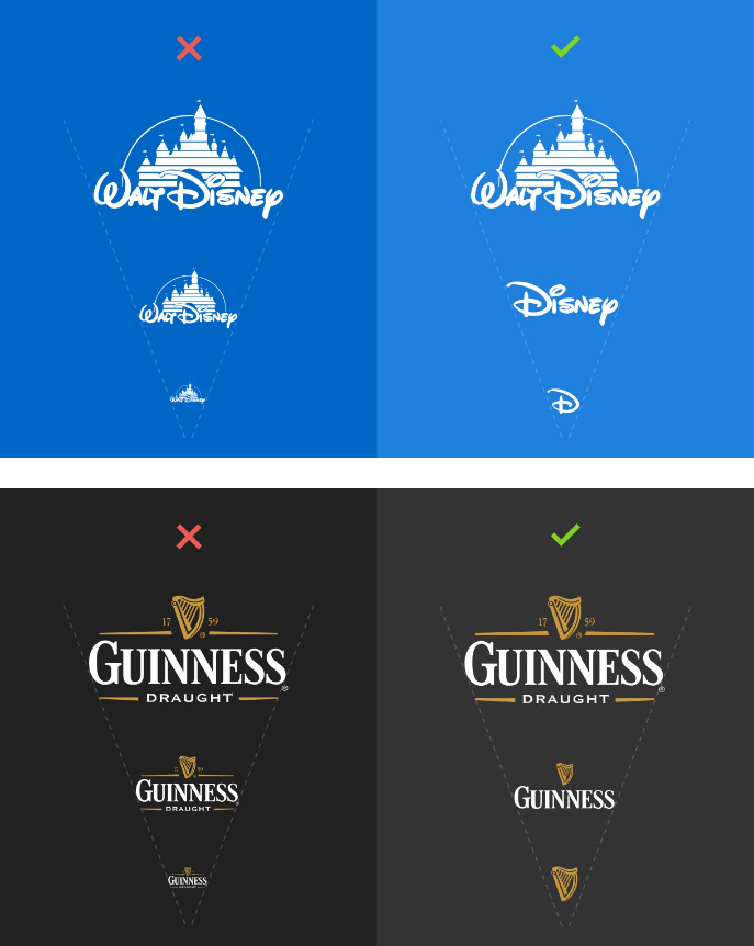
• Is the site mobile responsive and functioning beautifully across all devices, regardless of size and shape?
If I had a nickel for every instance that a website owner neglected the mobile experience of their website, I’d have a shitload of nickels (and to be fair, I see way too many developers pulling this too – and they should know better). Yes, still… in 2023.
Mobile responsiveness is not new. On a worldwide basis, mobile traffic has eclipsed desktop traffic. There is approximately zero good reasons for your website to not be mobile responsive. If anything, I would argue that more focus should be put into mobile optimization than typical desktop optimization.
With this in mind, consider how scalable your branding is. Does your logo look like a dumpster fire on a small screen? If so, it may be time to go back to the drawing board.
London-based digital designer Joe Harrison articulates scalable/responsive logos beautifully on his website, here’s an example he put together with a couple of well known brands:
This is barely scratching the surface, but ignoring basic design fundamentals tends to quickly file projects into the “bad design” category.
What about functionality?
Bad web design and bad web development can often go hand in hand in making or breaking the user experience for your website visitors.
While the list above primarily focuses on good and bad design, it’s important to recognize that design certainly isn’t the only thing you should be paying attention to. Of course it’s important, critical even, but we mustn’t ignore web development functionality and the critical role it can play.
I’ll dive in deeper on a future post, but briefly, don’t take things such as your website’s load time lightly. A slow website can destroy the user experience.
Don’t believe me? According to Google, “the probability of bounce increases 32% as the page load time goes from 1 second to 3 seconds.”
“Bounce” refers to “bounce rate“, a metric commonly used in Google Analytics which boils down to users landing on your website, and immediately leaving. While some of these metrics can be confusing, the important take away is quite simple: the slower your website, the higher percentage of visitors that are going to leave.
Wrapping it up
Good design builds trust. Good design shows authority in your industry. Good design allows your website visitors to easily find what they’re looking for. Good design evokes a fondness for your brand or product.
Bad design does the opposite, and your website is a key component in this.
If your website is poorly designed, how likely is a visitor to return? How does this effect the perception of your brand? Better yet, if your business can’t maintain a credible website, why should the visitor trust that the product or service you’re selling them isn’t equally subpar?
If your website was built by your co-worker’s third cousin who “kinda knows about websites”, you may want to critically evaluate your website design. Does your website give you nostalgia for 1996? Does your website induce seizures with the amount of flashing animations bombarding the screen? If you answered “yes” to any of these questions, it’s time for a rebuild (and may god have mercy on your soul).
And before you give yourself too hard of a time, at least you’re not responsible for these below (I hope).